Category: Latest News
Family Time
Posted By Sapp Design – Nov 10 | 2019
This year instead of doing the standard office Christmas party Sapp Design closed its door for the day and headed down to Silver Dollar City in Branson Missouri. We are a big family at Sapp Design and it was great to get to spend time with our co-worker’s families/significant others in order to put faces with the names we so loving talk about throughout the day at the office.
Seeing each other with our family is also a great reminder of why the work/life balance is so important and more than just a bullet point on a company mission statement but rather something that is always evolving and weaving an important cultural thread throughout Sapp Design.
ColorMix Forecast 2020
Posted By Sapp Design – Oct 21 | 2019
Sapp Designers welcomed in Sherwin Williams color of the year for 2020, Naval SW6244, a strong, brave, confident deep navy, at the Color Forecast on October 15th. The color of the year is a shade of sophistication that will be paired with natural tones and materials such as soft leathers, gleaming metals, and polished marbles. The trending color coordinates are mute gold, canary yellow, and kale green. In addition to the color of the year, Sherwin Williams forecasted five trendsetting color palettes: Mantra, Heart, Haven, Play, and Alive. Each pallet has a unique array of hues that establishes the overall theme of the year, “Color in Balance.”
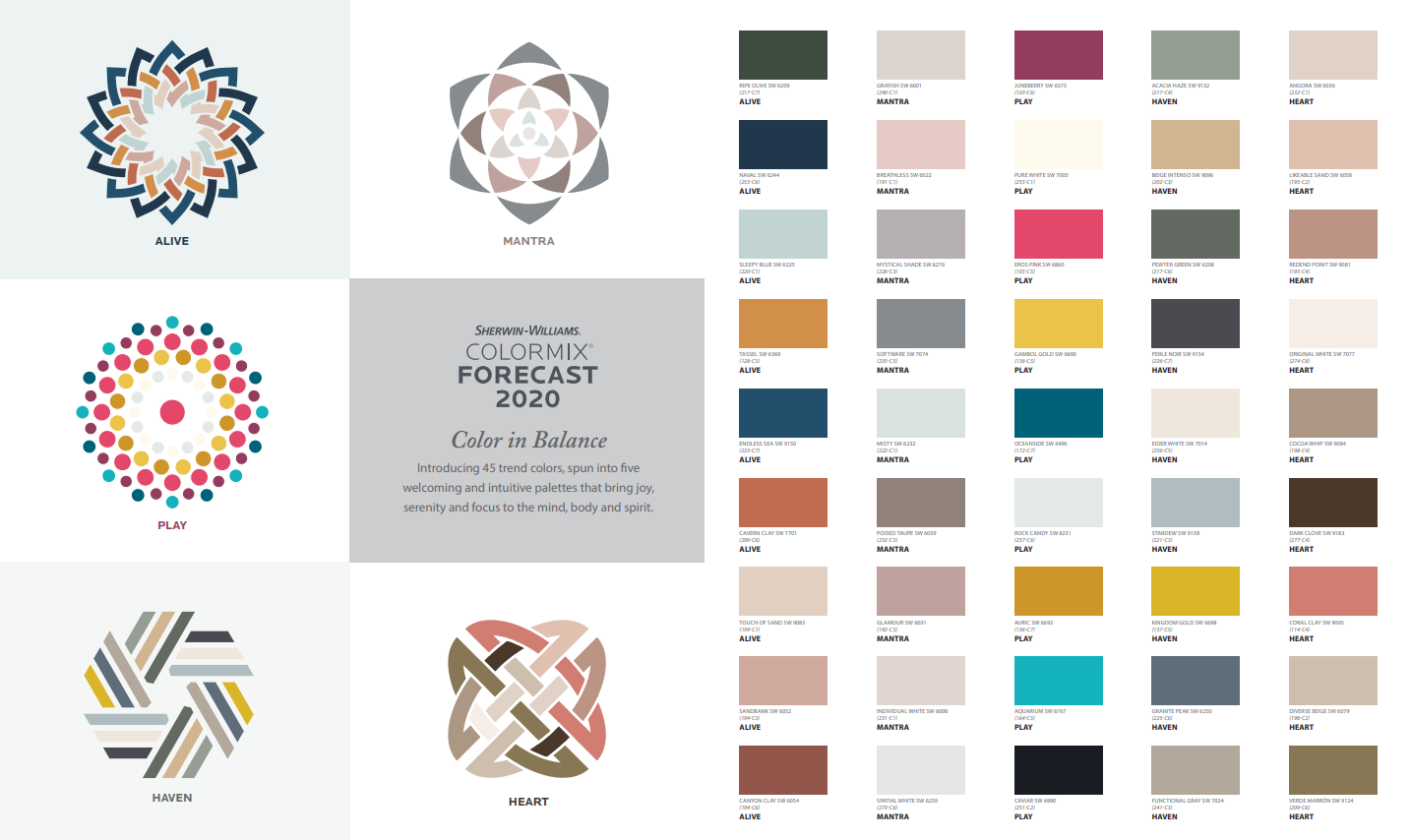
Mantra is calm muted pastels coordinating together to influence a sense of minimalism, serenity, and sanctuary. We will see soft, warm neutrals highlighted with dusty rose, mauve, and teals. Clean lines with accents of natural elements and solids embrace the feeling of peace.
Heart is a twist on Mantra with a slight edge. The bohemian influenced palette is unique and modern with twists of emotion. Shades of clay neutrals with a speckle of coral is influenced by humanity.
Haven, Sapp Design’s personal favorite, is a phenomenal array of earth tones embracing heath and simplicity. The palette includes shades of warm greens, soft neutrals, and touches of bold confident hues of blue and yellow.
Play is truly unique with energy and joy. The bold hues in this palette create a dynamic collection with a base solid of whites. The palette includes blues, oranges, yellows, and pinks. Punchy Pink is still in trend but forecasted to plateau and evolve into a blush pink that would still be utilized as a fun energic vibe.
Alive is truly appealing with rich tones influenced by optimism and globalization. These tones are a celebration of positivity evoked with a sense of community. The deep tones of navy and olive paired with pink-under toned neutrals will make a bold statement in any space.
Overall, the design industry seems to be embracing colors and materials that influence positivity and comfort in the space. Sapp is excited to embrace and drive the new trends of colors and materials into 2020.
Link: https://www.sherwin-williams.com/architects-specifiers-designers/color/color-forecast/2020-color-foreca